Friday, November 9, 2007

Project 6: Time Capsule

I was really excited when we got this project because I have always been interested in what a time capsule is and what goes in one. We have broken down this project into 4 phases so we can keep to a schedule and get this done by December 3.

Phase 1: Conception
For the beginning of our time capsule project we had to create a parti, an ideation and a statement of understanding and intention. For my parti I tried to answer the following questions in order to come closer to finding a better understanding what a time capsule truly is.
  • What is the capsule going to be shaped like?
  • What will go in the time capsule?
  • Where will it be located inside of the studio building?
Phase 2: Research
I was in Group 3 for the research part of the project and we were responsible for interviewing the faculty. Lindsey and I chose to interview John Rife, Stoel and Robert Charest, to find their views on the department and design as a whole.

Phase 3: Synthesis
Friday 11/9
Today we were asked to present the sketch models of our ideas and a refined parti with defined parameters, concept and goals. I made 5 different models that each represent time, and pictured below are my time capsule ideas.


I took some pictures of my designs to show my progress from my sketches on my parti to my final products.


Monday 11/12
Below are my revised models I made over the weekend, the first one is still the cluster of balls but I added paper mache to it to give it the feeling of being like a pinata. The second one is where I combined my hour glass model and my clusters to make a tower looking object that houses the spheres with the artifacts inside. Also pictured are my shaded sketches of my models for drawing class.


Wednesday 11/14
Today in class we made a detailed charette of our final model. My model showed how the spheres is connected with toothpicks, basically the simple design I drew earlier on trace paper. I cut out the inside to show how the spheres will connect.


Friday 11/17
Today we turned in our two detailed models that show specific parts of our project and how they are connected. While doing my first model, which shows how the two spheres are connected with two nails, I realized that I wanted to do more of a free standing model for Monday that incorporated the bowl like features that will hold little spheres. The spheres would be something that we could all contribute to, rolled up journal entries where we write to ourselves in the future about things that are happening to us this year.


Monday 11/19
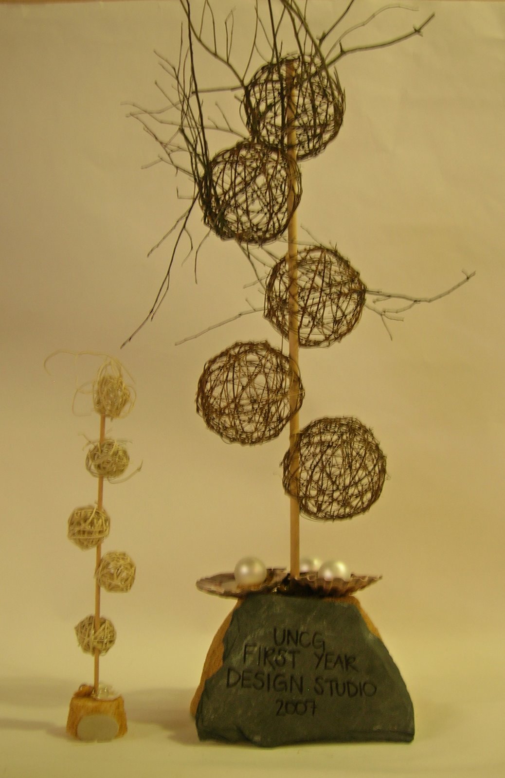
Over the weekend I was able to design a new time capsule idea that incorporated my cluster of spheres and a couple of new ideas. The shape of the spheres basically resembles how we come into the IARC program as first year students and learn to branch out from one another and find out who we really are.


Tuesday 11/20
Today I turned in my Time Capsule Process Zine which included my 15 thumbnail sketches and my prototype layout of one of my thumbnail ideas.


Phase 4: Design
Due on November 30, 2007 is our full-scale prototype and a composite drawing of our final time capsule.


Thursday, November 8, 2007

My Cube

There are so many ways to design a perfect cube. Unfortunately, I had to find out about 8 different ways of how not to before I was able to make my perfect cube. For my final one I used sobo glue to connect the straight edges of my matte board box cut out. The edges were cut straight for once and I actually measured it right down to the flap. I love my box and I think that this process has really helped me in my overall sense of detail.


Below are my drawings of a still life of 3 cubes I made. I used the diagonal hatching technique to show the difference in values.


On this one is used the same 3 cubes in a different still life and the smearing technique. It is kind of hard to see to differences because it is so light but I think it turned out pretty good.

Wednesday, November 7, 2007

Ten Buildings

1. The Gallery of Horyuji Treasures

The picture below is of the Tokyo National Museum that was designed by architect Yoshio Taniguchi. It was built in a natural & cultural setting to create and environment that is rare to present day Tokyo. The museum is widely known for its tranquility, order and dignity. This new gallery building was built over the old gallery in 1999, which was originally used only to preserve the works rather than to display them. I love this building because of how light passes through the outer glass walls to the middle of the building but is then suddenly blocked by a stone wall, in order to preserve the works. Inside the museum, Taniguchi included solid steel structures and extruded aluminium mullions that incorporates his qualities of accuracy and pure elegance.


2. Beach Cottage in the Hamptons

The beach house below was designed by Preston T. Phillips for close friends that live in East Hampton. Phillips created this house to evoke the informal houses of a simpler time, almost to contradict the fact that the Hamptons have changed so fast that people do not enjoy the beach anymore. They just go to say that the have a house in the Hamptons rather than to relax in their calm, carefree environment. I love this house because Phillips took his ideas from Edward Steichen's beautiful photograph of Isadora Duncan at the Acropolis. The peaceful photo was then transferred into a modern day beach house retreat.


3. Disney Concert Hall

Located in downtown Los Angeles, California this concert hall was designed by Frank Gehry for Walt Disney in 1987 and was finally finished in 2003. This concert hall is home to the Los Angeles Philharmonic and the Los Angeles Master Chorale. It was built for $274 million dollars to replace the Dorothy Chandler Pavilion, which had very poor acoustics. This building is so unbelievable because of its geometric shapes that come together to form a modern house of music. It houses a large concert organ that was also designed by Frank Gehry, whose keys are said to look like a bunch of falling french fries.


4. Falling Water

I chose this house because it looks like it was carved out of the rocks and it fits perfectly in its environment with the natural tones and huge waterfall, rightfully giving it its name "Falling Water". Designed by Frank Loyd Wright in 1935 this extraordinary house was built for Edgar Kaufmann. It replaced an old rundown cabin outside of Pittsburgh, owned by Kaufmann, for around $155,000 dollars. In 1964 Kaufmann donated the property to the Western Pennsylvania Conservancy and was opened to the public as a museum. This house is known for its dynamism and organically designed structure.


5. Burj al Arab

Located off the coast of Dubai, this gigantic hotel is not only the second tallest building in Dubai, but it also known as "The Best Hotel in the World". This amazing building was designed by Tom Wright and resembles a blowing sail. The hotel also has the world's tallest tennis court that is located on the top side of the hotel. I love this building because it is luxurious and symbolizes Dubai's urban transformation. It is made out of Teflon-coated fiberglass that curves around the reinforced concrete tower inside. The hotel was built by Said Khalil in 1994 at 321 meters and is about to be passed in size this year by the newest skyscraper in Dubai, the Rose Tower, which is 333 meters.


6. Emirates Office Tower

Standing at an outstanding 354.6 meter tall, the Emirates Office Tower is the tallest building in Dubai and the world. It was designed by architect Hazel W.S. Wong Norr and was finished in 1999. I like these buildings because they look very futuristic, like there from a Star Wars movie or something. Norr designed these towers deliberately and successfully to provide an iconic profile that dominates the business districts skyline. Below the towers is an oasis shopping mall and looking out to the side of the building is the horse racing grounds. The outside of the buildings are made out of aluminium panels with copper and silver glass the constantly capture the light of the desert sun.


7. Adobe Towers

The headquarters of Adobe Systems Inc. is the model for sustainable operations and the best example of an energy saving facility. I love the layout and intricate design of these three towers, it really proves that you can create a green building for a reasonable price. The buildings were designed by Bill Valentine in San Jose, California and is was completed in 2007 for $1.4 million dollars. This office building consist of three different towers and they all include high-pressure fluorescent tubes, motion-activated computer monitors and fans that only run twice a day for 3 hours at a time to keep the air quality above standards but at an energy efficient level. New products and technologies have been used around the buildings which make this more of a modern day appliance.


8. The Chicago Spire

I first saw this amazing building when architect, Blair Kamin, from Chicago came to Greensboro to talk to us about our architecture here and what we could do to improve. It was designed by Santiago Calatrava, who began construction on it in 2007. This skyscraper cost around $2.4 billion to create and reaches up 610 meters in the sky. I think I am so attracted to this building because it reminds me of the tower in the Emerald City in the Wizard of Oz. It is so tall that you cannot help but stare at it. It is definitely in the right location though, the city where skyscrapers were born. The top of the building looks like the end of a drill bit or a space ship taking off. It is awesome!!


9. BMW Headquarters

Shaped like a four-cylinder engine the BMW Museum/Headquarters in Munich, Germany was designed by architect K.Schwarzer. Clearly visible from the U-Bahn this enormous building towers over Munich as the highlight of the city. Shaped like a clover from above people say that the structure has brought BMW a lot of luck in their business affairs. Inside of the museum is the technical evolution of the automobile through the 20th century. I love the idea of bringing the inside of the automobile out and exposing it to the world in a different way.


10. The Louvre

One of the oldest, most beautiful museums in the world is the Louvre which is located in Paris, France. The glass pyramid of the Louvre is a true symbol of Paris, making it one of the most popular attractions along with the Eiffel Tower. The building used to be a royal palace and still is home to the Mona Lisa, Madonna of the Rocks, Venus de Milo and over a hundred more famous pieces. I first fell in love with this building when I went to Europe for a month in 2005 and was able to take a tour of the Louvre. It was absolutely amazing to be able to see something that is so old but still so unique.

Monday, November 5, 2007

Ten Products

1. Derek Marshall Lighting Marrakesh


I chose this Marrakesh lighting fixture because of its unique organic feel that incorporates American art glass and metal drop tubes. This was designed by Derek Marshall for his newest Pendant lighting fixture collection, and cost around $1,050.00. It was designed to create a strong local light such as over a dinging table or an island in a kitchen. Other types of Pendants by Derek Marshall include the Vortex, Sushi, Genji and Django. These beautiful pieces of art are well known in New Hampshire not only their beauty but also for their striking features of American contemporary finishes.


2. Jamie Young Butterworth

This very interesting Butterworth table lamp is designed with a mercury glass base and gathered drum shade in sheer black organza. Jamie Young designed this collection of table & floor lamps to "glam" up any interior space with elegance and sophistication, and have also been used in many TV shows and design magazines. I like this particular lamp because it is a great example of a modern accessory that is not extremely expensive, it only cost $645.00. Jamie Young's lamps are made by hand out of organic and natural materials.

3. Hartcorn Furniture + Design Dragonfly

This abstract Dragonfly desk tricks the eye with its duality of motion and rest. The bowed out table legs and simplicity remind me of the actual insect that inspired Hartcorn's design, the Dragonfly. Although this blonde-tone cherry desk is very beautiful, it comes with a rather large price tag of $6,800.00. I love this contemporary piece because it is very calming and takes me to a quiet place of relaxation. It is definitely a step up from our old, boring table desks. These Boston natives have won many awards for their unique designs & collections.


4. Heller UltraCube

This modern cube by Frank Gehry represents the evolution of his previous Right Twist model, with the added bonus of new technology and materials. I love this piece because it allows you to use our imagination for its purpose, whether you want it placed beside your front door or as an end table, it is so versatile. It is made out of three-ply urethane which is covered in silver automobile paint, making the outside of the cube very durable. With its sleek surface and flowing lines in a high gloss finish the UltraCube is a perfect example of Frank Gehry's attempts to better "humanize" a building.


5. Saunder Education Trey

Trey is by far the best invention of a chair since the rolling chair. It not only can be used as a floor rocker but it can also be used as a table/stool. This fabulous chair has a contoured seat and back cushions, pneumatic height adjustment, and is also spine-friendly! At around $60.00 you can have this comfortable chair to use in your office or dorm rooms. I like the neutral colors that the Saunder Education Co. chose because it is easy on the eye and the soft material reminds me of a relaxing spa recliner. It is also wonderful because its purpose is geared towards making today's students more comfortable & relaxed during their most stressful times.


6. Vitraform Peach Confetti

Since the bathroom is my favorite part of a house I chose this Peach Confetti glass sink. Just by introducing a new color to a room it can completely be transformed into a new, modern space. This freestanding sink by Vitraform is made out of matte glass and offers over ten different design engravings for the glass bowls. This particular sink was featured in Home & Garden magazine for its ability to bring art into home accessories.


7. Roche-Bobois Nonchalance Sofa

This new technology sofa definitely looks like it could live up to its name, I just want to run up and fall into it. It is made out of comfy leather which covers up a goose feather duvet. This one of a kind sofa comes with a remote control that allows you to choose your specific elevation for your legs and support for your back.


8. Terzani Untitled

This stainless steel creation by Bruno Rainaldi, of Terzani, is my ideal light fixture for a modern dining room. This lamp consists of a collection of geometrical plates, laser cut and lacquered in white on the back. I love this product not only because of its unique shape but also because of its new creative outlook on shapes. This sleek lighting piece is suspended both vertically and horizontally which creates a wonderful eye candy. It runs for around $3,731.00, which is not bad for a beautiful piece of modern day art.


9. Niedermaier Avalon

I chose this hourglass end table by Luke Wong because it immediately reminded me of the "Tulip Table" by Eero Sarrinen that we saw yesterday in class. I love its sleek, classy design with the curvy fiberglass body that turns into a thin glass top. It almost looks futuristic in a sense that the clean lines create a simple, modern space. This small accessory represents how our modern day designs are always going to be based on the past.


10. Brave Space Design Tetrad Bamboo


This bamboo storage piece by Brave Space Design was inspired by the game Tetris. These shapes were specifically chosen for sustainability purposes so they can be functional and hold a good amount of weight. The materials used include natural & amber bamboo, which provide relaxing warm tones to any space it is chosen to be put in. As playful as the shelving unit sounds the price however is not, at an outstanding $2,000.00 per unit. I love this unit because the style is a lot like how I want to design spaces in the future, playful but modern.